

What Colors Calm Kids: A Parent's Guide for 2026
TL;DR:
- Soft blue, sage green, and lavender are the most effective calming colors for children. Warm neutrals like cream and taupe provide a nurturing background. Bright, saturated colors increase alertness and should be avoided in sleep or calm spaces.
Soft blue, sage green, and gentle lavender are the colors that calm kids most effectively, according to color psychology research. These cool, muted tones lower physiological arousal by supporting melatonin production and reducing heart rate. Warm neutrals like cream and light taupe add a grounding, nurturing backdrop. Highly saturated colors such as fire-engine red, neon yellow, and bright orange do the opposite. They increase nervous system stimulation and keep children alert. Choosing the right palette for your child’s bedroom or calm-down corner is one of the simplest, most research-backed changes you can make for better sleep and lower stress.
Quick Summary
The most calming colors for children are soft blue, muted sage green, and gentle lavender. Warm neutrals like cream and taupe support these tones. Avoid bright reds, neon yellows, and saturated oranges in sleep or relaxation spaces.
TL;DR
- Soft blue supports melatonin and lowers heart rate
- Sage green reduces cortisol and creates a sense of safety
- Lavender promotes deeper sleep
- Warm neutrals feel nurturing, not clinical
- Avoid neon and saturated warm colors in calm spaces
Table of Contents
- Which colors calm kids and why
- How to apply calming colors in kids’ spaces
- Calming colors for kids with ADHD or anxiety
- Common mistakes when choosing calming colors
- Key Takeaways
- Perspective
- Promo
- FAQ
Which colors calm kids, and why do they work? {#which-colors-calm-kids}
Color psychology for calming children centers on one principle: cool, low-saturation tones reduce physiological arousal, while warm, high-saturation tones increase it. Cool-toned colors like soft blues, muted sage greens, and gentle lavenders effectively lower physiological arousal in children. That matters because a child’s nervous system responds to visual input before the brain consciously processes it.
Soft blue is the most studied calming color for children. Blue wavelengths support melatonin production, which is the hormone that triggers sleep onset. A soft, dusty blue on bedroom walls signals the brain to wind down. It also reduces heart rate, which is measurable and not just anecdotal.
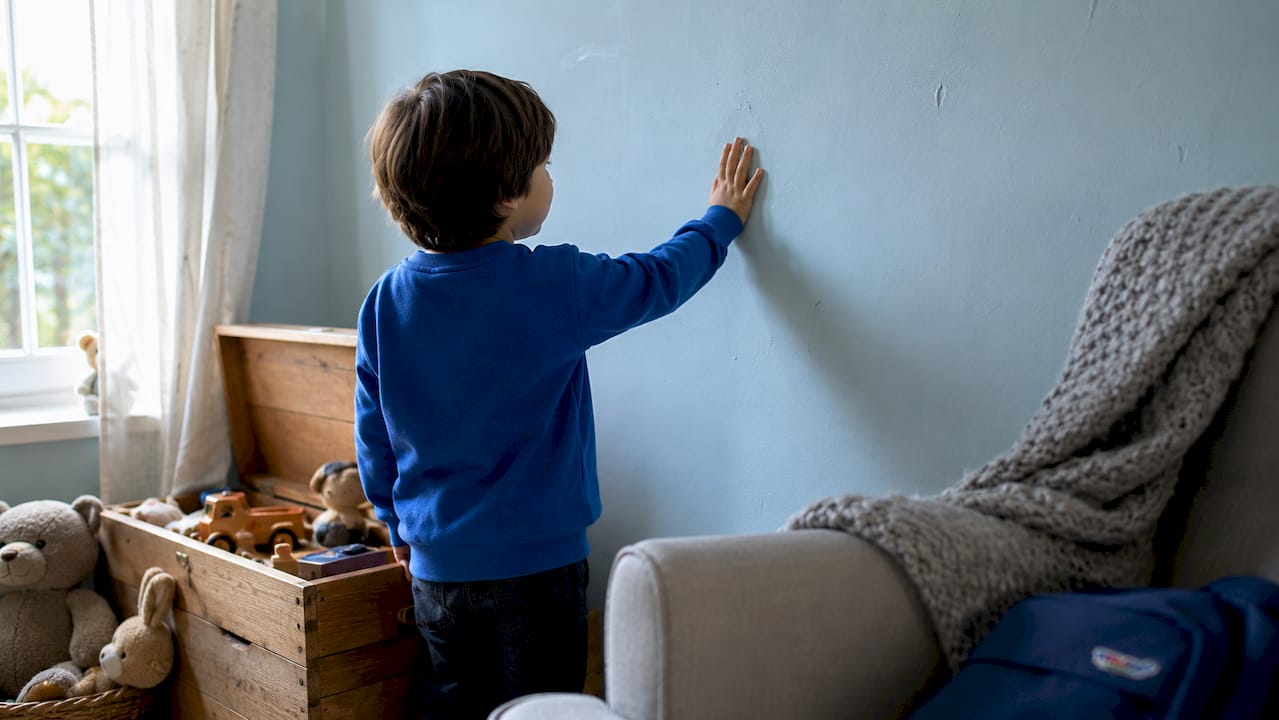
Muted sage green mimics the visual cues of nature. Research links nature-adjacent colors to lower cortisol levels and a stronger sense of safety. Sage green works especially well in rooms where children need to decompress after school or during transitions.
Gentle lavender sits at the intersection of blue and pink. It carries the physiological benefits of blue while feeling warmer and more playful. Parents often find it easier to sell lavender to a child who resists “baby blue.”
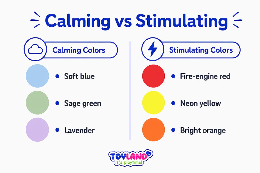
On the opposite end, highly saturated warm colors like fire-engine red, neon yellow, and bright orange increase heart rate and nervous system stimulation. These colors act as barriers to sleep routines by keeping children alert. They belong in play zones, not bedrooms or calm-down corners.
Calming vs. stimulating: a quick color comparison
| Color | Effect on children | Best use |
|---|---|---|
| Soft blue | Lowers heart rate, supports melatonin | Bedroom walls, ceiling |
| Muted sage green | Reduces cortisol, promotes safety | Bedroom, reading nook |
| Gentle lavender | Calms nervous system, aids sleep | Bedroom, calm-down corner |
| Warm cream or taupe | Nurturing, grounding backdrop | All rooms |
| Bright red or orange | Increases alertness and stimulation | Active play areas only |
| Neon yellow or green | Raises nervous system arousal | Avoid in sleep spaces |
Warm whites, creams, and light taupes provide a more nurturing, grounding backdrop than stark whites. Stark white feels clinical and cold, while warm neutrals feel safe and inviting. Use them as your dominant wall color and layer in soft accent tones.
Pro Tip: One important nuance: the idea that blue always calms and red always excites is an oversimplification. Color effects vary with context, lighting, and the overall noise level of the environment. A soft dusty blue in a cluttered, brightly lit room will not calm anyone.
How to apply calming colors in kids’ spaces {#how-to-apply}
Knowing which colors soothe children is only half the work. Application matters just as much. A poorly executed palette can undermine even the best color choices.
The most effective approach uses 2–3 colors: one dominant neutral, one soft accent, and one grounding tone. Think of it like designing a spa. Intentional simplicity creates calm. A room with seven competing colors creates visual chaos, regardless of how soft each individual shade is.
A practical step-by-step approach
- Choose your dominant neutral first. Warm cream, light taupe, or a very pale warm gray covers the majority of wall space. This sets a grounding, non-clinical tone.
- Add one soft accent color. Soft blue, sage green, or lavender works on one accent wall or in textiles like curtains and bedding. This is where the physiological calming effect lives.
- Ground the room with a third tone. A slightly deeper warm neutral, like a muted sand or warm greige, appears in rugs, furniture, or trim. It anchors the palette without adding stimulation.
- Paint the ceiling lighter than the walls. Painting ceilings a lighter tone than walls creates a cocooning effect that supports relaxation. The ceiling visually “lifts,” making the room feel safe and enclosed without feeling small.
- Match lighting to your palette. Lighting is as important as color in creating a calming environment. Harsh lighting suppresses melatonin and increases alertness. Use soft, warm-toned bulbs (2700K–3000K) for bedtime routines. Avoid cool white or daylight bulbs in sleep spaces.
For rooms that serve double duty as play and sleep spaces, use the color zones intentionally. Keep the sleep corner in soft blue or lavender tones. Allow slightly warmer, more energetic colors in the play zone. A simple area rug can define the boundary.
Pro Tip: Integrating your child’s room palette subtly with the rest of the home helps children feel secure. Visual predictability across rooms supports emotional regulation. You do not need to match rooms exactly. Just avoid jarring color shifts between spaces.
You can find more research-backed ideas in this 2026 bedroom color guide from Toylandeu™, which covers current recommendations for soothing sleep spaces.
How do calming colors help kids with ADHD or anxiety? {#special-needs}
Children with ADHD or anxiety are more sensitive to visual stimulation than neurotypical children. The effect of colors on kids’ emotions is amplified when a child’s nervous system is already working overtime. Getting the palette right in these cases is not a preference. It is a functional need.
Muted cool tones such as soft blue-gray, sage green, and warm taupe help children with ADHD reduce visual distractions and support focus. These colors lower the visual “noise” in a room, which reduces the cognitive load on an already taxed nervous system.
Key principles for children with ADHD or anxiety:
- Use a single dominant neutral for at least 70% of wall space
- Limit accent colors to one soft, muted tone
- Avoid neon colors, bright accent walls, and busy patterns entirely
- Keep artwork and wall decor minimal and low-contrast
- Choose nursery wall art in muted, low-contrast tones rather than bold graphic prints
Visual predictability, meaning consistent palettes without clashing high-contrast colors, reduces nervous system stress. This consistency helps overstimulated children regulate their emotions more effectively. A room that looks the same every time a child enters it becomes a reliable anchor.
Color alone does not regulate a child’s nervous system. It works best as part of a consistent environment that includes predictable routines, soft lighting, and reduced clutter. When these elements work together, the calming effect of a well-chosen palette becomes genuinely measurable in a child’s behavior and sleep quality.
For a deeper look at how color choices intersect with child behavior, the color psychology guide from Toylandeu™ covers the science in plain language.
Common mistakes when choosing colors to calm children {#mistakes}
Parents often make well-intentioned color choices that backfire. These are the most common pitfalls and how to avoid them.
- Going too dark. Deep navy or forest green can feel cozy in small doses, but covering all four walls makes a room feel enclosed and heavy. Children can feel trapped rather than calm.
- Using stark white as a default. White feels clean but reads as cold and clinical to a child’s nervous system. Swap it for a warm cream or pale taupe.
- Applying saturated colors over large areas. A muted sage green accent wall works. A full room of saturated teal does not. Saturation, not just hue, drives stimulation.
- Ignoring lighting. A perfect soft blue wall under cool fluorescent lighting will feel harsh and alert-inducing. Always test your color choice under the actual lighting conditions the room uses at bedtime.
- Overriding the child’s preferences entirely. A child who hates their room will not relax in it. Use their preferred color as the accent tone, not the dominant color. A child who loves purple gets a soft lavender accent wall, not a saturated violet room.
Pro Tip: Test paint samples at three different times of day: morning, afternoon, and evening with lamps on. Colors shift dramatically under different light. A warm taupe that looks perfect at noon can read as muddy orange at 7:00 PM.
Layering texture adds warmth without adding visual stimulation. A linen curtain, a knit throw, or a woven rug in a neutral tone makes a room feel cozy without introducing new colors that compete for attention.
Key Takeaways
Soft blue, sage green, and lavender are the most effective calming colors for children because they lower physiological arousal and support melatonin production.
| Point | Details |
|---|---|
| Top calming colors | Soft blue, sage green, and gentle lavender reduce heart rate and support sleep. |
| Warm neutrals as base | Use cream or light taupe as the dominant wall color for a nurturing, grounding feel. |
| Avoid saturated warm tones | Bright reds, neon yellows, and saturated oranges increase alertness and disrupt calm. |
| Lighting matters equally | Pair muted colors with warm-toned bulbs (2700K–3000K) to reinforce the calming effect. |
| Special needs require simplicity | Children with ADHD or anxiety benefit most from one dominant neutral and one soft accent color. |
Color is a tool, not a magic fix {#perspective}
By Thane Holland
After years of paying close attention to how children actually behave in designed spaces, the thing that strikes me most is how often parents focus entirely on wall color and ignore everything else. Color is real. The research on soft blues and melatonin is solid. But I have walked into rooms painted the most perfect dusty sage green, with a bright overhead fluorescent light humming away, and watched a child bounce off the walls at 9:00 PM.
The color is doing its job. The lighting is undoing it.
What I have found works is treating color as one layer of a system. The palette sets the tone. Lighting reinforces it. Texture adds warmth without visual noise. Routine locks it in. When all four work together, the results are genuinely striking. Parents report faster sleep onset, fewer meltdowns during transitions, and calmer mornings.
The other thing I would push back on is the idea that calming colors have to be boring. Lavender is not boring. A warm sage green with cream trim and a linen curtain is not boring. These palettes are quiet, not empty. There is a real difference. Children feel it, even if they cannot name it.
Start with one change. Paint the ceiling a shade lighter than the walls. Add a warm-toned lamp. See what shifts. You do not need to repaint the entire room to move the needle.
— Thane Holland
Creative play in calming colors: Toylandeu™ picks for relaxed kids {#promo}
Color does not stop at the walls. The toys and art supplies you bring into a child’s space carry their own visual weight. Bright, neon-heavy toys in a carefully curated calm room work against everything you have built.

Toylandeu™ carries art kits and creative sets that fit naturally into a calming environment. The Montessori Drawing Kit gives children a focused, quiet creative outlet that supports the kind of calm engagement you want before bedtime. The DIY Drawing Scroll and the 24-Color Clay Modeling Kit round out a calming activity corner with tactile, low-stimulation play. Free worldwide shipping is included on all orders.
FAQ
What colors calm kids the most?
Soft blue, muted sage green, and gentle lavender are the most effective calming colors for children. These cool, muted tones lower heart rate and support melatonin production.
Should I avoid white walls in a child’s bedroom?
Stark white feels cold and clinical rather than nurturing. Warm cream or light taupe is a better choice for a child’s sleep space.
Do calming colors help kids with ADHD?
Muted cool tones like soft blue-gray, sage green, and warm taupe help children with ADHD reduce visual distractions and support focus. Avoid neon colors and busy patterns entirely.
Does lighting affect how calming colors work?
Lighting is as important as color in a calming environment. Harsh or cool-toned lighting suppresses melatonin even in a perfectly painted room. Use warm-toned bulbs for bedtime spaces.
Can I use my child’s favorite color even if it is bright?
Use a saturated favorite color as a small accent, not a dominant wall color. A child who loves red can have red in a throw pillow or bookshelf without it overpowering the room’s calming effect.