

Calming Colors for Kids: Best Hues for Peaceful Rooms
TL;DR:
- Calming colors for children include soft blues, greens, and neutrals that promote relaxation and better sleep. Applying these hues with the 60-30-10 rule and adjusting for age and personal preferences creates an environment conducive to emotional regulation. Personal reactions matter most, so room colors should reflect each child’s unique responses rather than solely following trends.
Calming colors for kids are defined as soft, low-saturation hues, primarily blues, greens, and warm neutrals, that reduce physiological arousal and support emotional regulation in children. Color psychology, the study of how hues affect mood and behavior, confirms that the right palette in a child’s room does more than look pretty. It actively lowers heart rate, supports melatonin production, and creates the visual predictability children need to feel safe. Blue, green, and lavender rank as the top three calming colors for sleep and emotional regulation in 2026 standards. Getting this right is one of the most practical things you can do for your child’s well-being.
Which colors are scientifically proven to calm children?
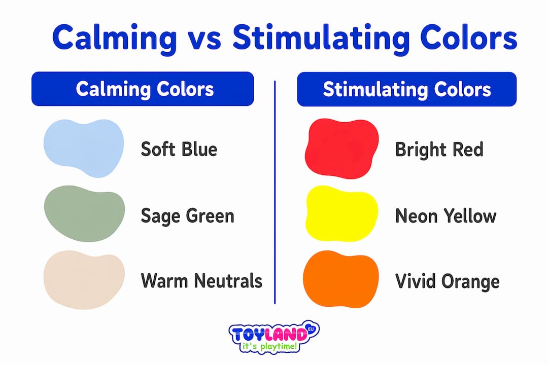
Blue and green are the most effective calming colors for kids. Both hues lower heart rate and support melatonin production, the hormone that signals the brain it is time to sleep. Lavender sits close behind, offering a gentle, slightly warm quality that many children find easier to accept than a stark cool blue.
On the opposite end, bright red and neon yellow increase nervous system arousal and suppress melatonin. That is why a playroom painted fire-engine red feels electric at 8 p.m. when you are trying to wind your child down. Muted pastels measurably lower physiological arousal compared to saturated primaries.
Neutral tones, specifically warm white, cream, and soft gray, serve as the foundation of any child-friendly color palette. They do not compete for attention, they visually open a space, and they give the brain nothing to react to. Think of them as the silence between notes in music.
| Color | Effect on children | Best use |
|---|---|---|
| Soft blue | Lowers heart rate, supports melatonin | Sleep areas, nurseries |
| Sage green | Reduces tension, promotes calm focus | Bedrooms, reading corners |
| Lavender | Gentle relaxation, mild warmth | Nurseries, toddler rooms |
| Warm white / cream | Neutral, visually spacious, non-stimulating | Walls, ceilings, base tones |
| Bright red / neon yellow | Raises arousal, suppresses melatonin | Avoid in sleep and wind-down spaces |
Pro Tip: Paint a small test swatch at least 12 inches square and observe it at different times of day before committing. Natural light shifts color temperature dramatically between morning and evening.
How to apply calming color palettes in children’s rooms
The 60-30-10 rule is the most reliable framework for a calming room. 60% neutral base, 30% calming color, 10% accent gives the room visual structure without tipping into monotony. A cream wall with sage green bedding and a single dusty rose throw pillow is a textbook example of this ratio working well.
Color zoning takes the concept further. Soft blue behind the bed and a different tone in the play area teaches children, subconsciously, which part of the room is for rest and which is for activity. Designers use this technique to build mental associations that support self-regulation without a single word of instruction.
Do not dismiss darker tones. Navy and charcoal in small doses create a cocooning effect that many children find deeply sleep-inducing. A navy accent wall behind a bed, paired with cream and white elsewhere, often works better than an all-pastel room for children who feel anxious in overly bright spaces.
Common mistakes to avoid:
- Painting every wall the same saturated color, even a calming one, creates visual monotony that can feel oppressive
- Using bright accent colors on the ceiling, which sits in a child’s direct line of sight when lying down
- Choosing colors based solely on trends rather than your child’s actual response
- Ignoring textiles: curtains, rugs, and bedding carry as much color weight as paint
Pro Tip: Swap out textiles before repainting. A new rug or set of curtains in a soothing hue costs less and lets you test a color’s effect before any walls change.
Do calming color needs change as children grow?
Color needs shift significantly with age. Toddlers respond well to warmer, nurturing tones like muted terracotta, peach, and soft yellow. These hues feel safe and stimulating enough to support early sensory development without tipping into overstimulation.
School-age children benefit from a shift toward cooler, more desaturated tones. Soft blue-gray, dusty sage, and muted teal support concentration and reduce visual distraction during homework or reading. The goal at this stage is a room that feels calm but not sleepy at 4 p.m.
One factor most parents overlook: a child’s personal emotional association with a color overrides its general psychological effect. A child who associates blue with a frightening hospital visit will not find blue calming, regardless of what the research says. Ask your child directly. Their answer tells you more than any color chart.
Age-based color guidance at a glance:
- Infants and toddlers: Soft peach, muted terracotta, warm cream, gentle lavender
- Preschool (ages 3–5): Pale sage, soft yellow, light aqua
- School age (ages 6–12): Dusty blue, cool gray, desaturated teal, warm white
- Tweens: Deeper muted tones, charcoal accents, navy, forest green
Beyond color: why your mood matters as much as the paint
A calm parent produces a calmer child. Room color affects caregiver mood, which in turn shapes the emotional climate the child lives in. A room that soothes you at bedtime makes it easier to stay patient during a difficult wind-down routine.
Visual predictability matters too. A consistent color palette reduces the number of things competing for a child’s attention. Frequent, dramatic color changes in a room can contribute to overstimulation, particularly for children who are sensitive to sensory input. Stability in the environment supports stability in mood.
Color works best as part of a broader sensory-friendly design approach. Pairing peaceful shades for nurseries with noise-reducing strategies, soft textures, and low lighting at bedtime multiplies the calming effect. Resources like noise-reducing activities from BANZ® Carewear USA offer practical tools that complement a calming room environment. You can also explore color psychology for kids at Toylandeu™ for a deeper look at how hues shape development.
Key Takeaways
Soft blues, greens, and warm neutrals are the most effective calming colors for kids, and applying them with the 60-30-10 rule and age-appropriate adjustments produces the strongest results.
| Point | Details |
|---|---|
| Top calming colors | Blue, green, and lavender lower heart rate and support melatonin in children. |
| Avoid saturated primaries | Bright red and neon yellow raise arousal and disrupt sleep; limit them in bedrooms. |
| Use the 60-30-10 rule | 60% neutral base, 30% calming color, and 10% accent prevents visual overload. |
| Adapt colors by age | Warm tones suit toddlers; cool, desaturated hues support focus in school-age children. |
| Personalize to the child | A child’s emotional association with a color matters more than general psychology rules. |
What I have learned from watching parents get this wrong
By Thane Holland
Most parents start with Pinterest and end up with a room that looks great in photos but does not actually help their child sleep. The mistake is treating color psychology like a formula. You pick blue, you paint the walls, you expect calm. Real life is messier than that.
The most effective rooms I have seen share one quality: they were built around the child’s specific reactions, not a trend. One parent I spoke with painted her daughter’s room a soft sage green based on every recommendation she could find. Her daughter hated it. She associated green with the smell of a doctor’s office. They switched to a warm dusty peach, and the difference in bedtime behavior was immediate.
Darker tones are the most underused tool in this space. Parents assume calming means pale and airy. A deep navy accent wall, used correctly, creates a sense of enclosure that many children find genuinely soothing. It is the visual equivalent of a weighted blanket.
My strongest advice: update the room’s color scheme as your child grows. A palette that worked at age four will feel babyish and wrong at age nine. That mismatch creates low-level friction every time your child walks in. Periodic updates, even just new textiles, keep the environment aligned with who your child is right now.
— Thane Holland
Calm creativity starts with the right tools

A calming room sets the stage, but what your child does inside it matters just as much. Art and creative play are among the most effective ways for children to process emotions and wind down after a stimulating day. Toylandeu™ carries a curated selection of creative kits designed with exactly this in mind.
The Montessori Drawing Kit from Toylandeu™ pairs structured, open-ended art activities with a calm, focused format that complements the soothing environment you are building. For children who love color exploration, the colorful drawing scroll kit offers a hands-on way to engage with hues in a relaxed, creative context. Both ship worldwide with free delivery.
FAQ
What are the best calming colors for a child’s bedroom?
Blue, green, and lavender are the top three calming colors for children’s bedrooms. These hues lower heart rate and support melatonin production, making them ideal for sleep and wind-down spaces.
Should I avoid all bright colors in a child’s room?
Bright reds and neon yellows raise physiological arousal and should be limited in sleep areas. Soft accents in warmer tones are fine in small doses, especially in play zones away from the bed.
How does color affect a child’s sleep?
Calming colors like soft blue and sage green support melatonin production, the hormone that signals sleep. Saturated primary colors suppress melatonin and make it harder for children to self-regulate at bedtime.
What colors work best for toddlers versus school-age kids?
Toddlers respond well to warm, nurturing tones like muted peach and soft terracotta. School-age children benefit from cooler, desaturated hues like dusty blue and gray, which support focus and reduce distraction.
What if my child dislikes the color I chose?
A child’s personal emotional association with a color overrides its general calming effect. If your child reacts negatively to a hue, switch to one they respond to positively, regardless of what the research recommends.