

Psychology of Colors: How Hues Shape Your Emotions
TL;DR:
- Color psychology explores how hue, lightness, and intensity influence emotions and behaviors. These effects vary across cultures and personal experiences, shaping design choices in marketing, interiors, and branding. Using subtle color accents and understanding individual preferences create more impactful emotional responses.
Color psychology is defined as the study of how colors influence human emotions, thoughts, and behaviors through measurable psychological mechanisms. It is not a soft concept. The PAD (Pleasure-Arousal-Dominance) model confirms that color-matching schemes directly influence emotional experience and function as a multidimensional psychological tool in product design. Researchers at Los Alamos National Laboratory identify three core dimensions of color perception: hue, saturation (intensity), and lightness. Ignoring any one of them produces weaker emotional results. Whether you are designing a brand, decorating a room, or choosing what to wear, the psychology of colors gives you a concrete framework for making choices that actually land.
Quick Summary
Color psychology explains how hue, lightness, and intensity combine to trigger emotional and behavioral responses. These effects are real but not universal. Culture, personal history, and context all shape how any individual responds to a given color. Practical applications span marketing, interior design, and personal well-being.
TL;DR
- Hue alone does not determine emotional impact. Lightness and intensity matter just as much.
- Warm colors energize; cool colors calm. Both can overwhelm when overused.
- Culture and personal experience shape color meaning more than most people expect.
- Strategic use of color in small doses (accent walls, accessories) produces the strongest results.
Table of Contents
- How do colors influence human emotions and behavior?
- What are the emotional associations for key colors?
- How do culture and context shape color responses?
- What are practical applications of color psychology?
- Key Takeaways
- Perspective
- Promo
- FAQ
How do colors influence human emotions and behavior?
Color perception is a three-dimensional experience. Hue, saturation, and lightness each contribute independently to the emotional signal a color sends. A bright, pure red feels urgent and energizing. A muted, grayish red feels tired and flat. The hue is the same. The emotional effect is completely different.
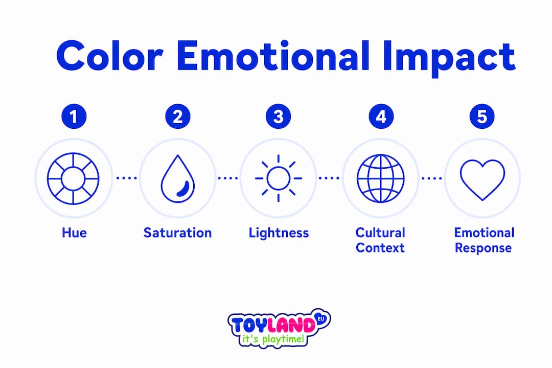
The Pleasure-Arousal-Dominance model, known as PAD, gives researchers a way to measure these effects numerically. A study with 216 participants validated the PAD framework integrated with Kansei Engineering and fuzzy grey relational analysis for color emotional design. That means designers can now quantify which color combinations produce pleasure, arousal, or a sense of control in users before a product ships.
Pure and light colors are most associated with high-energy joy, while colors with gray tones mute emotional impact. Ingrid Fetell Lee’s research on color purity shows this clearly. A pastel yellow feels cheerful. A muddy yellow feels stale. The difference is not the hue. It is the purity.
Color vision itself evolved as a survival mechanism. Bright colors trigger ancient neurological circuits tied to detecting ripe fruit and nourishment. That is why saturated, vivid colors feel more alive. Your brain is wired to respond to them.
Key emotional effects by color dimension:
- High lightness + high purity: joy, energy, optimism
- Low lightness + low saturation: calm, melancholy, or fatigue depending on hue
- High saturation + warm hue: urgency, excitement, appetite stimulation
- High saturation + cool hue: focus, trust, calm alertness
Pro Tip: When evaluating a color for design or marketing, check it in grayscale first. If it loses all its emotional punch, the hue is doing too much work and the lightness or saturation is not pulling its weight.
What are the emotional associations for key colors?
Warm hues like red and orange stimulate energy and approach behaviors. Cool tones like blue and green foster calmness and concentration. A meta-analysis of 22 studies from 2015–2025 confirms these effects hold across marketing and education contexts. That consistency makes warm and cool color families the most reliable starting points for intentional color use.
| Color | Common emotional association | Context where it works best | Overuse risk |
|---|---|---|---|
| Red | Energy, urgency, passion | Calls to action, food branding | Anxiety, aggression |
| Orange | Enthusiasm, warmth, creativity | Youth brands, entertainment | Visual fatigue |
| Yellow | Optimism, clarity, attention | Signage, children’s spaces | Overwhelm, eye strain |
| Blue | Calm, trust, focus | Offices, healthcare, finance | Low energy, coldness |
| Green | Balance, relaxation, growth | Wellness, nature, education | Boredom if overused |
| Pink | Kindness, creativity, softness | Beauty, lifestyle, children’s products | Perceived immaturity |
Pink deserves special attention. It is frequently dismissed as a niche color, but research links it to feelings of kindness and creative openness. Used as an accent rather than a dominant tone, it shifts the emotional register of a space or brand without overwhelming it.
The table above reflects general tendencies, not rules. A deep navy blue in a luxury fashion context reads as sophistication, not calm. A bright red in a children’s toy signals fun, not urgency. Context always modifies the base emotional signal a color carries.
How do culture and context shape individual color responses?
Color preferences are largely learned, not innate. Ecological Valence Theory holds that people prefer colors associated with positive objects or experiences from their past. Someone who grew up surrounded by lush green forests will likely respond more positively to green than someone who associates it with illness. The color itself has not changed. The learned association has.
Culture amplifies this effect dramatically. White signals purity and new beginnings in many Western contexts. In parts of East Asia, white is the color of mourning. A brand that uses white packaging globally without accounting for this difference risks sending the wrong message in key markets. The 2014 Annual Review of Psychology confirmed that color’s influence on psychology is nuanced and non-universal, moderated by situational context, individual experience, and culture.
How color perception shifts across retail contexts is also worth noting. Research on color in shopping environments shows that cultural background shapes how buyers interpret color cues in product presentation and fashion. A color that signals premium quality in one market may read as cheap or garish in another.
Factors that moderate color response:
- Cultural background: learned symbolic meanings vary widely across regions
- Personal history: positive or negative associations with specific colors from childhood
- Task and environment: a color that aids focus in an office may feel sterile in a living room
- Individual traits: introverts often prefer cooler, lower-saturation colors; extroverts tend toward warmer, brighter ones
Understanding your audience’s cultural context is not optional. It is the difference between a color choice that resonates and one that alienates.
What are practical applications of color psychology?
Color psychology helps reduce stress, improve sleep, regulate energy, and enhance communication when applied contextually in homes and environments, according to Mental Health America. That is a broad claim, but the mechanism is straightforward. Color affects arousal levels. Arousal levels affect mood and performance. Choose the right color for the right context, and you shift the baseline.
Four practical applications worth acting on:
- Workspace design: Use blue or green as dominant tones for focus-heavy work. Add a warm accent color (orange or yellow) in areas meant for collaboration or creative brainstorming. The contrast between zones signals a shift in mental mode.
- Bedroom and sleep environments: Cooler, lower-saturation colors like soft blue, lavender, or sage green support relaxation. Bright warm colors for entertainment and cool subdued colors for relaxation is the core principle Mental Health America applies to home color guidance.
- Brand and marketing design: Match color intensity to the emotional register of your message. A sale announcement can use high-saturation red. A trust-building brand story works better in muted, cooler tones. Mismatching intensity and message is one of the most common errors in brand color use.
- Children’s learning spaces: Bright, pure colors support energy and engagement. Avoid overstimulating combinations for spaces meant for focused learning. Toylandeu™ carries art kits for kids that apply these principles directly to creative development.
Overexposure to even calming colors can overwhelm. Practitioners consistently recommend moderate doses: an accent wall, a set of cushions, or a single piece of art rather than painting every surface. The dose determines the effect.
Pro Tip: Before committing to a wall color, live with a large painted swatch (at least 12 inches by 12 inches) for 48 hours under different lighting conditions. Color constancy means your brain adjusts to ambient light, and a color that looks perfect at noon can feel completely different at 8 PM.
Key Takeaways
Color psychology works because hue, lightness, and intensity each carry independent emotional weight, and culture, context, and personal history determine how any individual actually responds.
| Point | Details |
|---|---|
| Three dimensions matter | Hue, saturation, and lightness each shape emotional impact. Ignoring any one weakens the effect. |
| Warm vs. cool is a starting point | Warm colors energize; cool colors calm. Both require careful dosing to avoid overwhelm. |
| Culture changes meaning | White signals purity in some cultures and mourning in others. Always research your audience’s context. |
| Learned associations drive preference | Ecological Valence Theory shows color preferences form through positive life experiences, not innate wiring. |
| Small doses amplify impact | Accent walls and accessories produce stronger emotional shifts than saturating an entire environment. |
Why subtlety in color use beats saturation every time
Most people assume more color means more impact. My experience studying affective design research tells a different story. The PAD model research makes this concrete: it is not the presence of a color that drives emotional response, it is the combination of its purity, lightness, and placement. A single vivid accent in a neutral room creates more psychological tension and interest than a room painted entirely in that same color.
The other misconception I see constantly is treating color psychology as a universal rulebook. Red means danger. Blue means calm. That framing ignores the entire body of research on cultural moderation and Ecological Valence Theory. A color that triggers warmth and nostalgia for one person triggers anxiety for another, based entirely on their personal history. The science does not give you a formula. It gives you a framework for asking better questions about your specific audience.
What I find most useful in practice is focusing on intensity before hue. Get the saturation and lightness right for the emotional register you want, then choose the hue. Most designers do it the other way around, and that is why so many color choices feel slightly off even when the “right” color was selected. Experiment with this order and the results will surprise you.
— Thane Holland
Color and creativity: tools for hands-on learning at Toylandeu™
Understanding color psychology is one thing. Putting it into practice, especially with children, requires the right tools.
Toylandeu™ offers a range of creative kits designed to make color exploration hands-on and genuinely fun. The Enchanting Kids Art Workbook Montessori Drawing Kit gives children a structured but playful way to experiment with color, form, and expression. For families who want to go further, the 24-color clay modeling kit brings color theory into three dimensions through tactile creative play. Both kits ship worldwide with free delivery, making them accessible wherever you are. Browse the full creative range at Toylandeu™.
FAQ
What is the psychology of colors?
Color psychology is the study of how colors affect human emotions, behavior, and decision-making through hue, lightness, and intensity. Its effects are real but moderated by culture, context, and personal experience.
How do colors affect mood in everyday environments?
Mental Health America reports that color choices in homes can reduce stress, improve sleep, and regulate energy levels. Cool, low-saturation colors support relaxation; bright warm tones increase energy and alertness.
Are color-emotion associations the same across cultures?
No. A 2014 Annual Review of Psychology confirmed that color’s psychological influence is non-universal. White, for example, signals purity in many Western cultures but mourning in parts of East Asia.
What is the PAD model in color psychology?
The Pleasure-Arousal-Dominance model is a framework that measures emotional responses to color across three dimensions. A study with 216 participants validated its use in product color design when combined with Kansei Engineering.
How can I use color psychology in marketing?
Match color intensity to your message’s emotional register. High-saturation warm colors suit urgency and calls to action; muted cool tones build trust. Always account for your audience’s cultural background before finalizing brand colors.
Recommended Reads
- Psychology of Color: How Hues Shape Emotions and Behavior — Toylandeu™
- Color Theory in Psychology: How Colors Shape Your Mind — Toylandeu™
- Toy Color Choices’ Surprising Role in Child Development 2025 — Toylandeu™