

Color Theory and Psychology: How Colors Shape You
TL;DR:
- Color theory explains the relationships between colors, while color psychology explores how colors evoke emotional responses. Combining both fields enables more effective design and marketing strategies rooted in cultural and contextual understanding.
Color theory and psychology define the scientific and artistic frameworks that explain how colors affect human emotions, perceptions, and behaviors. These two fields work together: color theory provides the structural rules of color relationships, while color psychology explains the emotional and behavioral responses those colors trigger. Understanding both gives you a real advantage in design, marketing, and personal expression. Research confirms that color drives up to 80% of consumer brand recognition. That single fact explains why every major brand treats color as a strategic asset, not a decoration.
Quick summary
Color theory and psychology together explain how colors are perceived biologically and how they influence emotions and behavior. The impact of any color depends on culture, context, and individual experience, not universal rules. Designers and marketers who apply evidence-based frameworks like Kansei Engineering and the PAD model get more predictable emotional results than those who rely on color folklore.
Tl;dr
- Color perception starts in the retina with three cone types and gets interpreted by the brain through opponent processes.
- Warm colors tend to energize; cool colors tend to calm. But culture and context override these defaults.
- Color accounts for up to 80% of brand recognition.
- Frameworks like Kansei Engineering and the PAD model help predict emotional responses to color.
- Always test color choices across devices, lighting conditions, and cultural contexts before finalizing.
Table of contents
- How Does Human Vision Process Color?
- What Are the Emotional Effects of Different Colors?
- How Does Color Psychology Apply in Design and Marketing?
- Which Theories and Frameworks Explain Color Psychology Best?
- Key Takeaways
- Thane’s Take: Why Color Rules Are Made to Be Broken
- Explore Color Creativity with Kids
- FAQ
How does human vision process color?
Color perception begins in the retina, where three types of cone cells detect light. The trichromatic theory explains that S-cones detect short wavelengths (blue), M-cones detect medium wavelengths (green), and L-cones detect long wavelengths (red). These three signals combine to produce the full spectrum of colors you see. This is why screens use red, green, and blue pixels to render every image.
But detection is only half the story. The brain then interprets those signals through a second process called opponent process theory. This model describes how the visual system processes color in antagonistic pairs: red versus green, blue versus yellow, and light versus dark. Opponent process theory explains why you can never perceive a reddish-green simultaneously. It also explains color afterimages. Stare at a red square for 30 seconds, then look at a white wall, and you will see green.
Understanding both trichromatic and opponent process theories is essential to grasp how we perceive unique hues and afterimages. Neither theory alone tells the complete story of color vision.
The distinction between detection and interpretation matters for designers. Your retina detects a color accurately, but your brain interprets it based on surrounding colors, lighting, and emotional state. A gray square looks darker on a white background than on a black one. This is simultaneous contrast, and it is why color choices never exist in isolation.
- S-cones: Detect blue wavelengths (short)
- M-cones: Detect green wavelengths (medium)
- L-cones: Detect red wavelengths (long)
- Opponent channels: Process red/green, blue/yellow, and light/dark contrasts in the brain
What are the emotional effects of different colors?
Color symbolism in psychology follows general patterns, but those patterns are not universal laws. Warm colors like red, orange, and yellow tend to increase arousal, urgency, and energy. Cool colors like blue, green, and purple tend to promote calm, trust, and focus. These associations are real but conditional. Color meaning is not universal: green signals money in U.S. fintech branding but signals nature and wellness in health product packaging.

Gender and individual experience also shift emotional responses significantly. A 2026 study found that female participants responded more positively to winter street interface colors compared to male participants, with measurable brain signal differences. Complex color palettes in that same study correlated with increased positive emotions overall. This means a single-color assumption for your audience will miss a meaningful segment of users.
| Color | Common Association | Context Where It Shifts |
|---|---|---|
| Red | Energy, urgency, passion | Danger or aggression in safety contexts |
| Blue | Trust, calm, professionalism | Cold or distant in some cultural contexts |
| Green | Nature, health, growth | Money and finance in U.S. branding |
| Yellow | Optimism, warmth, attention | Anxiety or caution in high-saturation use |
| Purple | Creativity, luxury, mystery | Mourning in some Latin American cultures |
Pro Tip: Never assume a color carries the same meaning across cultures. Test your palette with a representative sample of your actual audience before committing to a brand color system.
Color psychology depends on individual memory, culture, and context rather than fixed emotional triggers. Red can signal energy or anger depending entirely on who is looking and why. This is the most important rule in applied color psychology, and it is the one most often ignored.
How does color psychology apply in design and marketing?
Color psychology in design works best when color aligns with every other sensory element in the environment. Research on multisensory color interaction shows that pairing color with matching soundscapes enhances positive emotional responses more than color alone. A spa using cool blue tones paired with natural ambient sounds produces stronger feelings of calm than either stimulus alone. Designers who treat color as one layer in a multisensory system get better emotional results.
Here is a practical framework for applying color psychology in design and marketing:
- Define your emotional goal first. Decide whether you want to energize, calm, build trust, or create urgency before selecting any color.
- Map your audience’s cultural context. Identify the primary cultural backgrounds of your users and research color associations specific to those groups.
- Use Kansei Engineering to validate choices. A 2026 Kansei Engineering study with 216 participants confirmed that specific color-matching schemes produce stable, predictable emotional responses. This framework translates subjective feelings into measurable design criteria.
- Test across devices and lighting. Colors shift dramatically between a calibrated design monitor and a budget smartphone screen. Test color choices across devices, lighting conditions, and accessibility standards before finalizing any palette.
- Check accessibility standards. WCAG 2.1 contrast requirements exist for a reason. Low-contrast color combinations exclude users with color vision deficiencies, which affects roughly 8% of men globally.
Pro Tip: Use tools like Adobe Color, Coolors, or Contrast Checker to audit your palette for both emotional impact and accessibility compliance before launch.
The impact of color on mood extends beyond aesthetics into measurable behavior. Retail environments that use warm accent colors near checkout areas report higher impulse purchase rates. Digital interfaces that use blue for primary action buttons consistently outperform red in trust-sensitive contexts like banking and healthcare.
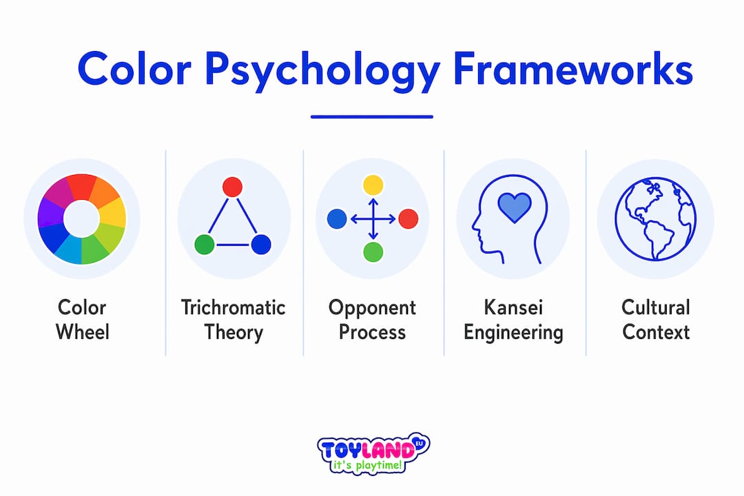
Which theories and frameworks explain color psychology best?
Five major frameworks define the field of color theory and psychology. Each explains a different layer of how color works on the human mind.
| Framework | Core Concept | Practical Use |
|---|---|---|
| Color Wheel (Itten/Munsell) | Organizes hue, saturation, and value relationships | Guides palette harmony in visual design |
| Trichromatic Theory | Three cone types detect red, green, blue | Explains screen color rendering and color blindness |
| Opponent Process Theory | Brain processes color in antagonistic pairs | Explains afterimages and simultaneous contrast |
| Kansei Engineering | Maps emotional responses to design attributes | Validates color choices with measurable emotional data |
| PAD Model | Measures Pleasure, Arousal, and Dominance | Quantifies emotional states triggered by color environments |
No single framework covers everything. Trichromatic theory explains how you detect color. Opponent process theory explains how your brain interprets it. The PAD model and Kansei Engineering translate those perceptions into measurable emotional outcomes that designers can test and refine. Using them together gives you a complete picture of how color influences behavior from the retina to the decision point.
Key takeaways
Color psychology produces reliable results only when color choices account for biology, culture, context, and multisensory environment together.
| Point | Details |
|---|---|
| Biology shapes perception first | Trichromatic and opponent process theories explain how the eye and brain detect and interpret color. |
| Culture overrides universal rules | Green means money in U.S. finance but nature in wellness; always research your audience’s cultural context. |
| Color drives brand recognition | Color accounts for up to 80% of consumer brand recognition, making it a primary marketing tool. |
| Frameworks reduce guesswork | Kansei Engineering and the PAD model convert subjective color feelings into testable, measurable design criteria. |
| Multisensory alignment amplifies impact | Pairing color with matching soundscapes or textures produces stronger emotional responses than color alone. |
Thane’s take: why color rules are made to be broken
After years of watching designers and marketers apply color psychology, the most common mistake I see is treating color associations as facts rather than tendencies. Someone reads that blue builds trust and immediately makes every button blue. Then they wonder why their conversion rate did not move.
The evidence on color psychology is clear on one point: valid claims require context, culture, and audience specificity. Without those three variables, you are working with superstition dressed up as science. I have seen red work beautifully in a wellness brand because the founder understood her specific audience’s cultural relationship with the color. I have seen blue fail completely in a food brand because it suppressed appetite in that context.
What actually works is treating color as a hypothesis, not a conclusion. You form a theory based on your audience research, you test it with real users, and you measure emotional response using frameworks like the PAD model. The designers who get color right are not the ones who memorize color meaning charts. They are the ones who stay curious about their specific audience and keep testing.
The other thing most articles skip: color never works alone. Research on visual-auditory interaction confirms that matching color with appropriate sound enhances emotional impact beyond what either stimulus achieves independently. If you are designing a space or a digital experience and you are only thinking about color, you are leaving emotional impact on the table.
— Thane
Explore color creativity with kids
Color theory comes alive fastest through hands-on making. Toylandeu™ carries art kits designed to help kids experiment with color, mixing, and creative expression in ways that build real intuition for how colors work together.
The Enchanting Kids Art Workbook Montessori Drawing Kit gives children a structured but open-ended way to explore color relationships, shading, and composition. For kids who love tactile work, the Vibrant 24-Color Clay Modeling Kit lets them physically blend colors and see how hues combine in three dimensions. Both kits ship worldwide with free shipping through Toylandeu™, making them easy gifts for young artists at any level.
FAQ
What is the difference between color theory and color psychology?
Color theory defines the structural relationships between colors on the color wheel, including hue, saturation, and value. Color psychology studies the emotional and behavioral responses those colors produce in people.
Why do colors affect emotions differently across cultures?
Color symbolism is shaped by cultural history, personal experience, and context rather than biology. Green signals finance in U.S. branding but nature in wellness contexts, showing that meaning is learned, not hardwired.
What is kansei engineering in color design?
Kansei Engineering is a framework that translates subjective emotional responses into measurable design criteria. A 2026 study using 216 participants confirmed it can predict stable emotional reactions to specific color combinations.
How does opponent process theory explain color afterimages?
Opponent process theory describes how the brain processes color in antagonistic pairs like red versus green. When one channel fatigues from prolonged stimulation, the opposing color appears as an afterimage.
Can color alone change how someone feels in a space?
Color contributes significantly to mood, but research shows that pairing color with matching soundscapes produces stronger emotional responses than color alone. Multisensory alignment amplifies the impact of any single color choice.