

Color Psychology: How Colors Shape Emotions and Behavior
TL;DR:
- Color psychology explains how hues influence human emotions, perceptions, and behaviors through biological, cultural, and personal factors. The PAD model, combined with local testing, provides a reliable approach to applying color effects in marketing and design. Responses to colors vary widely based on context, culture, and individual experiences, emphasizing the need for careful testing and calibration.
Color psychology is the study of how colors influence human emotions, perceptions, and behaviors through a combination of biological hardwiring, cultural conditioning, and personal memory. Your brain processes color signals 200 milliseconds before it reads a single word, which means every design choice, brand palette, and room color is already working on your nervous system before you consciously register it. Understanding this mechanism gives you a real edge in marketing, design, and even personal decision-making. This guide covers the latest research, practical application steps, and the most common mistakes people make when putting these principles to work.
Quick summary
Color psychology explains how specific hues trigger emotional and behavioral responses by activating the brain’s visual cortex, limbic system, and learned memory networks. The most reliable framework for applying it is the PAD model (Pleasure, Arousal, Dominance), combined with local cultural testing rather than universal color charts.
Tl;dr
- Your brain reads color before text, making it your most powerful first-impression tool.
- Color responses are shaped by biology, culture, and personal history. No single color means the same thing to everyone.
- The PAD model and A/B testing are the most reliable ways to apply color psychology in real projects.
- Red can increase attraction or trigger anxiety depending on context. Always test in your specific environment.
- Kids’ color exposure during play directly supports cognitive and emotional development.
Table of contents
- What Does Research Say About How Colors Influence Emotions?
- How Do Biology, Culture, and Personal History Shape Color Responses?
- How to Apply Color Psychology in Marketing, Design, and Personal Development
- What Common Mistakes Should You Avoid in Color Psychology?
- What Tools and Techniques Support Effective Color Application?
- Key Takeaways
- Perspective
- Explore Color-Rich Art Kits for Kids
- FAQ
What does research say about how colors influence emotions?
Color psychology operates through three interconnected systems: retinal processing, the brain’s visual cortex, and the limbic system where emotions are generated. The limbic system processes color alongside personal history, which is why two people can have opposite reactions to the same shade of green. This is not a flaw in the science. It is the science.

The most important research framework right now is the PAD model, which maps color responses across three emotional dimensions: Pleasure (how good a color feels), Arousal (how activating it is), and Dominance (how much control it creates). A 2026 study of 216 participants combined the PAD model with fuzzy Grey Relational Analysis to optimize product color schemes, achieving a structural reliability score of 0.817. That level of precision is only possible when you treat color as a measurable variable, not a gut feeling.
Here are three well-documented color effects that illustrate how context shapes outcomes:
- Red increases perceived attractiveness in dating contexts but triggers anxiety in testing settings, according to the Color-in-Context Theory. Same color, opposite effects.
- Pink produced the highest hand strength scores in a study measuring physical performance across room colors, while gray produced the lowest. The physiological effects of color are measurable, not just subjective.
- Blue is widely assumed to calm everyone, but blue can increase arousal in individuals whose personal or cultural baseline associates it with alertness or urgency.
Pro Tip: Before assigning emotional meaning to any color in a project, define which PAD dimension you are targeting. Pleasure, Arousal, and Dominance require different hues and saturation levels.
| Color | Common Association | Context-Dependent Reversal |
|---|---|---|
| Red | Energy, urgency, passion | Anxiety in academic or high-stakes settings |
| Blue | Calm, trust, reliability | Arousal in cultures associating it with alertness |
| Pink | Softness, warmth | Increased physical performance in controlled studies |
| Gray | Neutrality, professionalism | Reduced physical performance and low mood |
How do biology, culture, and personal history shape color responses?
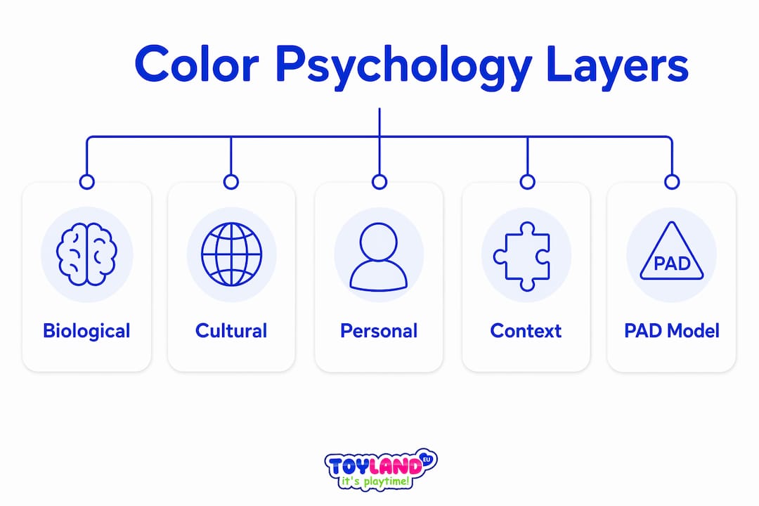
Three distinct layers determine how any person responds to a color. Treating them as separate forces, rather than one unified rule, is what separates effective color strategy from guesswork.
Biological baseline. Humans share evolutionary associations with certain colors. Green signals safety and vegetation. Red signals blood, fire, and urgency. These responses are baked into the nervous system and appear across cultures. They are the floor, not the ceiling, of color meaning.
Cultural overlay. White signals mourning in several East Asian traditions and purity in Western ones. Red represents celebration in China and danger in many Western safety contexts. Learned associations vary individually and culturally, which is why a color palette that converts well in São Paulo may underperform in Seoul. Experts recommend a universal principles plus local calibration approach rather than relying on static color meaning tables.
Personal memory. A person who associates yellow with a childhood illness will not respond to it the way a brand strategist expects. Individual memory is the most unpredictable layer and the hardest to design around at scale.
“Color meanings derive from learned associations and context, not fixed emotional triggers. The same hue can represent both danger and celebration depending on who is looking at it.” — Verywell Mind
For toy designers and educators, this layered model has a direct application. Research on toy color choices shows that color selection in children’s products affects engagement, mood, and even learning outcomes. The biology is consistent. The cultural and personal layers require testing.
How to apply color psychology in marketing, design, and personal development
Applying the psychological effects of colors effectively requires a structured process, not intuition. Follow these steps to move from theory to results.
- Define your emotional objective. Use the PAD model to identify whether you want to increase Pleasure (warmth, satisfaction), Arousal (energy, excitement), or Dominance (confidence, control). Each goal points to a different part of the color spectrum.
- Select a palette that fits your audience and context. A children’s art kit calls for high-saturation, warm hues that signal play and safety. A financial services brand needs cooler, lower-saturation tones that signal trust and stability. Match the palette to the emotional state you want to create, not to generic color meaning charts.
- Test before you commit. Run A/B tests on digital assets. Collect user feedback on physical environments. The Color-in-Context Theory confirms that the same color produces different effects in different settings, so real-world testing is non-negotiable.
- Calibrate for local culture. Global brands like Coca-Cola and IKEA adapt their color use by region. You should too. What reads as energetic in one market reads as aggressive in another.
- Iterate based on data. Color decisions are not permanent. Treat them as hypotheses and update them when the data tells you to.
Pro Tip: When testing color in digital marketing, isolate color as the single variable. Change nothing else in the ad or landing page. Otherwise you cannot attribute performance shifts to the color change.
| Approach | Best For | Risk |
|---|---|---|
| Fixed color charts | Quick reference, early ideation | Ignores cultural and contextual variation |
| PAD model + testing | Product design, branding, UX | Requires time and sample size |
| Gut feeling only | Personal creative projects | Unreliable at scale |
What common mistakes should you avoid in color psychology?
The biggest misconception in color psychology is that colors have fixed, universal meanings. Color psychology is not a magic bullet. Real effects come from complex brain processes and learned interactions moderated by individual differences. Treating a color chart as a rulebook leads to poor decisions.
Watch out for these specific errors:
- Ignoring lighting and surrounding colors. A warm orange looks aggressive under cool fluorescent light. The same orange looks inviting under warm incandescent light. Context changes everything.
- Skipping cultural research. Launching a product with a color palette that carries negative associations in your target market is an avoidable mistake. Test locally before scaling.
- Assuming your personal reaction is universal. Designers and marketers often project their own color associations onto their audience. Your response to a color is shaped by your specific biology, culture, and history.
- Relying on popular color psychology articles over primary research. Most viral color psychology content oversimplifies the science. The PAD model and peer-reviewed studies give you a more reliable foundation.
What tools and techniques support effective color application?
Industry professionals use a combination of quantitative frameworks and audience research to make color decisions that hold up under real conditions.
The PAD model combined with fuzzy Grey Relational Analysis is the most rigorous current method for matching color schemes to emotional outcomes. It treats color selection as a data problem, not a creative one. This approach is especially useful in product design and environmental branding.
Practical tools and methods worth using:
- Emotional mapping workshops. Map your audience’s desired emotional states before selecting any colors. This forces clarity on the PAD dimensions you are targeting.
- A/B testing platforms. Tools like Google Optimize or VWO let you test color variations on digital assets with statistical confidence.
- Color contrast analyzers. Accessibility tools like the WebAIM Contrast Checker confirm that your color choices work for users with color vision differences, which affects roughly 8% of men globally.
- Audience surveys and focus groups. Especially useful for physical environments and product packaging where digital testing is not possible.
For parents and educators, color application extends into play environments. Mindful color choices in children’s spaces, drawing from traditions like Buddhist color symbolism, can support calm, focused learning atmospheres.
Key takeaways
Color psychology works because it operates on three simultaneous layers: biological instinct, cultural conditioning, and personal memory, and no single layer overrides the others.
| Point | Details |
|---|---|
| Brain speed advantage | Color is processed 200ms before text, making it your most powerful first-impression signal. |
| PAD model is the standard | Map color choices to Pleasure, Arousal, and Dominance dimensions for measurable emotional outcomes. |
| Context changes everything | The same color can attract or repel depending on environment, culture, and individual history. |
| Test locally, not globally | Universal color charts are starting points. Local audience testing determines what actually works. |
| Kids benefit from color-rich play | Color exposure during creative play supports cognitive and emotional development in children. |
Why i stopped trusting color charts (and what i use instead)
I spent years watching designers and marketers reach for the same tired color psychology charts. Blue equals trust. Red equals urgency. Green equals health. The problem is that these charts flatten a genuinely complex system into a lookup table, and then people are surprised when the results do not match the prediction.
The research is clear on this. Color responses are context-dependent and baseline-sensitive. The same blue that calms one person activates another. The same red that drives conversions on one landing page tanks them on another. I have seen this play out repeatedly in real projects.
What actually works is treating color as a variable in a testable hypothesis. Define the emotional state you want to create. Select a palette based on the PAD model. Test it with your specific audience in your specific context. Iterate. That process is slower than consulting a chart, but it produces results that hold up.
The other thing I would push back on is the idea that color psychology is only for designers and marketers. Parents choosing toys, teachers setting up classrooms, and individuals decorating their own spaces all make color decisions that affect mood and behavior. The science applies everywhere. You just have to be willing to test rather than assume.
— Thane
Explore color-rich art kits for kids at toylandeu™
Color psychology does not stop at screens and storefronts. For children, hands-on color exploration during creative play directly supports emotional regulation, cognitive development, and sensory learning.
Toylandeu™ carries art kits designed with color-rich, developmentally appropriate materials that put these principles into practice. The Montessori Drawing Kit guides children through structured color exploration that builds fine motor skills and creative confidence. The Colorful Drawing Scroll gives kids a large-format canvas for free color expression. Both ship worldwide with free delivery. Browse the full range at Toylandeu™ and give kids the tools to learn through color.
FAQ
What is color psychology?
Color psychology is the study of how colors affect human emotions, perceptions, and behaviors through biological, cultural, and personal factors. It draws on neuroscience, design theory, and behavioral research.
Does color psychology work the same for everyone?
No. Color responses vary by culture, personal history, and context. Red signals celebration in China and danger in many Western settings. Testing with your specific audience is the only reliable approach.
What is the PAD model in color psychology?
The PAD model maps emotional responses to color across three dimensions: Pleasure, Arousal, and Dominance. A 2026 study used it alongside fuzzy Grey Relational Analysis to optimize product color schemes with a reliability score of 0.817.
How does color affect children’s behavior?
Research shows that room color directly affects children’s physical performance and mood. Pink rooms produced the highest hand strength scores in one study, while gray rooms produced the lowest. Color-rich play environments support cognitive and emotional development.
What is the color-in-context theory?
The Color-in-Context Theory states that the same color produces different psychological effects depending on environment and purpose. Red increases attractiveness in social settings but can trigger anxiety in high-stakes academic contexts.