

Psychology of Color: How Hues Shape Emotions and Behavior
TL;DR:
- The psychology of color examines how hues influence human emotions and behaviors through biological and cultural factors. Context and environment significantly modify perceived emotional responses, making in-context testing essential for accurate understanding. Multidimensional models like PAD provide more reliable insights than traditional fixed associations for effective design and marketing.
The psychology of color is the scientific study of how hues influence human emotions, perceptions, and behaviors across different contexts. Formally studied under the broader umbrella of color theory in psychology, this field draws on biology, neuroscience, and cultural learning to explain why a red wall feels energizing while a pale blue room feels calm. Researchers like Carl Jung recognized color’s emotional significance decades ago, and 2026 studies now confirm that color perception psychology is far more context-dependent than simple rules like “red means danger” or “green means nature” suggest. The effects are real, measurable, and surprisingly nuanced.
Quick Summary
The psychology of color proves that hues trigger measurable emotional and physiological responses shaped by biology, language, and environment. Context determines whether a color feels pleasant or unsettling. Designers, marketers, and educators who apply multidimensional emotional models get better results than those who rely on fixed color-emotion rules.
TL;DR
- Red raises heart rate. Blue promotes calm. But context changes everything.
- The PAD model (Pleasure-Arousal-Dominance) measures color emotions more accurately than simple associations.
- Language shapes how your brain categorizes and perceives color.
- Test colors in real settings, not just as isolated swatches.
- Color psychology applies directly to marketing, product design, urban planning, and children’s learning.
Table of Contents
- How do colors affect human emotions and behaviors?
- Why does context matter in color perception and preference?
- Comparing traditional color-emotion associations with multidimensional models
- How can understanding color psychology improve design and marketing strategies?
- Key Takeaways
- Perspective
- Explore color learning kits for kids at Toylandeu™
- FAQ
How do colors affect human emotions and behaviors?
Color psychology studies how hues influence perception, behavior, and emotions through both biological hardwiring and learned associations. The two mechanisms work together, and separating them is harder than most people assume.

On the biological side, different wavelengths of light trigger distinct physiological responses. Red light, for instance, activates the sympathetic nervous system, raising heart rate and increasing alertness. Blue light does the opposite, promoting a parasympathetic response associated with calm and focus. These reactions are not purely cultural. They appear across populations with minimal prior exposure to color-coded environments.
The psychological layer adds complexity. Learned associations from childhood, culture, and repeated exposure shape how you evaluate a color emotionally. Carl Jung used color symbolism extensively in his analytical psychology, arguing that certain hues carry archetypal emotional weight. Modern researchers formalized this with the Pleasure-Arousal-Dominance (PAD) emotional model, which measures three independent dimensions of emotional response rather than collapsing everything into a single “positive or negative” rating. This dimensional approach captures far more of what people actually feel.
- Pleasure: Does the color feel good or bad?
- Arousal: Does it feel stimulating or calming?
- Dominance: Does it feel controlling or submissive in the environment?
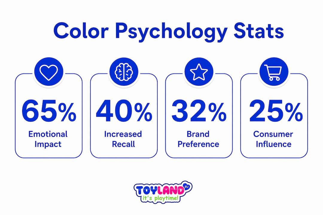
Art therapy practitioners use these mechanisms deliberately. A therapist might introduce warm yellows and oranges to lift mood in a clinical space, or use muted blues and greens to reduce anxiety. Marketing teams at brands like Coca-Cola (red for energy and urgency) and Facebook (blue for trust and stability) have applied color-emotion associations for decades, though recent research suggests their choices work partly by accident and partly by design.
Pro Tip: When evaluating how a color affects mood, ask three separate questions: Does it feel pleasant? Does it feel stimulating? Does it feel powerful? These map directly to the PAD dimensions and give you a more useful read than a single “I like it” or “I don’t.”
Why does context matter in color perception and preference?
Abstract color preference does not reliably predict how people will evaluate colors in real space. This finding from a 2026 Frontiers in Psychology study using self-report and eye-tracking is one of the most practically important results in recent color research. It means that asking someone “do you prefer blue or green?” tells you almost nothing about how they will feel in a blue or green room.
Environmental factors compound this effect. A 2026 Frontiers in Public Health study on winter streetscapes found that low saturation with high color complexity positively influenced emotional wellbeing, directly contradicting the common assumption that bright, harmonious colors always feel better. In cold, gray winter environments, visual complexity and subtle color variation provided more emotional relief than saturated, “cheerful” palettes. The environment itself changes what the brain needs from color.
Language adds another layer. A 2026 PMC study demonstrated that linguistic labels modify neural circuits to sharpen or blur color category boundaries. If your language has distinct words for light blue and dark blue (as Russian does, with “goluboy” and “siniy”), your brain processes those shades as more categorically distinct than if your language uses a single word for both. This is not a metaphor. Neural overlap between color representations measurably changes based on labeling.
| Context factor | Effect on color perception |
|---|---|
| Isolated swatch vs. real space | Preference in isolation often reverses in spatial context |
| Seasonal environment | Winter settings favor low saturation and high complexity over bright harmony |
| Language and labeling | Distinct color words sharpen neural category boundaries |
| Brightness and saturation | High brightness does not universally improve emotional response |
Pro Tip: Never finalize a color scheme by reviewing swatches on a white background. Test colors in context by placing them in a mockup or physical prototype of the actual environment. The difference in emotional response can be dramatic.
Comparing traditional color-emotion associations with multidimensional models
Simple color-emotion rules have real limitations. Saying “red means anger” or “blue means calm” ignores cultural variation, individual history, and the specific context in which a color appears. Red means luck in China, mourning in South Africa, and danger in Western traffic systems. A single-word emotional label cannot carry that weight.
The PAD model addresses this directly. By measuring pleasure, arousal, and dominance as separate dimensions, it captures the full emotional texture of a color experience. A deep burgundy might score high on pleasure and dominance but low on arousal. A neon yellow might score high on arousal but low on dominance. These profiles are far more useful for design decisions than “yellow feels happy.”
A 2026 PLOS ONE study took this further by combining the PAD model with fuzzy Grey Relational Analysis to evaluate product color schemes for a household hair dryer. The hybrid method produced stable, multidimensional rankings that aligned with eye-tracking data, confirming that participants’ stated emotional responses matched where they actually looked. This kind of validation is rare in color research and gives the PAD-fuzzy GRA approach strong credibility for product design applications.
- Traditional rules work as rough heuristics, not reliable design tools.
- PAD adds dimensional nuance that simple associations miss entirely.
- Hybrid methods like PAD combined with fuzzy GRA allow designers to rank and optimize color schemes by emotional impact with measurable confidence.
- Complex multidimensional models provide more reliable design guidance than intuition or trend-based color choices.
The practical implication is clear. If you are designing a product, a space, or a marketing campaign, using a dimensional emotional framework gives you a defensible, testable basis for your color decisions rather than a gut feeling dressed up as expertise.
How can understanding color psychology improve design and marketing strategies?
The importance of color in marketing lies in its ability to communicate brand personality and shift consumer behavior before a single word is read. Color is processed faster than text, which means it sets emotional expectations the moment a product or page appears.
Effective color strategy requires matching hue to audience, culture, and medium. A color that signals premium quality in one market may signal caution in another. Urban designers working on public spaces now use physiological measurement alongside surveys to test whether proposed color palettes actually improve wellbeing, not just whether focus groups say they look nice.
Here is a practical framework for applying color psychology in design and marketing:
- Define the emotional target. Use PAD dimensions to specify what you want the audience to feel: pleasant and calm, or stimulating and powerful?
- Research cultural associations. Verify that your chosen color carries the intended meaning for your specific audience and region.
- Test in context. Place colors in realistic mockups or physical prototypes, not isolated swatches.
- Measure beyond preference. Use physiological signals or behavioral data (eye-tracking, time-on-page) alongside self-report to validate emotional impact.
- Revisit seasonally. Environmental conditions change what colors feel appropriate. A palette that works in summer may feel wrong in winter.
When Toylandeu™ considers toy color choices for children’s products, the same principles apply. Bright, high-saturation colors stimulate arousal and engagement in young children, which is appropriate for active play. Softer, lower-saturation palettes support focus and calm, making them better suited for learning-oriented toys.
Key takeaways
Color psychology proves that emotional responses to hues are shaped by biology, language, cultural learning, and environmental context working together, not by fixed color-emotion rules.
| Point | Details |
|---|---|
| Biology and learning both matter | Color effects combine hardwired physiological responses with culturally learned associations. |
| Context overrides isolated preference | Colors evaluated as swatches often produce opposite reactions in real spatial environments. |
| PAD model outperforms simple rules | Measuring pleasure, arousal, and dominance gives more reliable design guidance than single-word emotion labels. |
| Language shapes perception | Distinct linguistic labels for color shades sharpen neural category boundaries and alter discrimination. |
| Test in real settings | Finalize color decisions using scene-based evaluation with physiological or behavioral measurement, not swatch reviews. |
Color science is more unsettled than designers admit
Most design education still teaches color psychology as a set of reliable rules. Red excites. Blue calms. Green signals nature. I have spent enough time reading the actual research to say plainly: those rules are useful starting points and unreliable endpoints.
What strikes me most about the 2026 studies is how consistently they find that context dismantles fixed associations. The winter streetscape research is a perfect example. Designers who followed conventional wisdom and reached for bright, saturated palettes to “cheer up” a gray urban environment would have gotten it wrong. The data said low saturation and high complexity worked better. That is a counterintuitive result that only emerges when you measure what people actually feel rather than what they say they prefer in a survey.
The language finding is equally underappreciated. If your brain’s neural representation of two similar colors changes based on whether your language gives them different names, then color perception is partly a linguistic phenomenon. That should make every designer pause before assuming their color choices will land the same way across cultures and languages.
My honest recommendation: treat the PAD model as your minimum standard for color evaluation. It is not perfect, but it forces you to think in three dimensions instead of one. Pair it with in-context testing and at least one physiological measure, and you will make better decisions than 90% of practitioners working from intuition alone. The science is moving fast. Stay curious, stay skeptical of simple rules, and test everything.
— Thane
Explore color learning kits for kids at Toylandeu™
Understanding how colors affect emotions is one thing. Giving children hands-on tools to explore that relationship is another entirely.
Toylandeu™ carries art and creativity kits designed to put color theory into practice from an early age. The Montessori Drawing Kit guides children through structured color exercises that build both creative confidence and emotional vocabulary. For tactile learners, the 24-Color Clay Modeling Kit turns color mixing into a sensory experience, reinforcing how different hues feel as well as look. Both kits align with what the research shows: active, context-rich engagement with color produces deeper understanding than passive observation. Free worldwide shipping is included on all orders.
FAQ
What is the psychology of color?
The psychology of color is the scientific study of how hues influence human emotions, perceptions, and behaviors. Effects are shaped by both biological responses to light wavelengths and learned cultural associations.
Does color really affect mood?
Yes. Red increases physiological arousal, while blue promotes calm. The PAD model measures these effects across three dimensions: pleasure, arousal, and dominance, providing more precise data than simple mood labels.
Why do color preferences change in different environments?
Abstract color preference does not predict spatial preference reliably. Environmental factors like brightness, saturation, and seasonal context alter emotional responses, meaning a color you love as a swatch may feel wrong in a real room.
How does language affect color perception?
Linguistic labels modify neural circuits that represent color categories. Languages with more distinct color terms produce sharper neural boundaries between similar shades, directly influencing how people discriminate and remember colors.
How is color psychology used in marketing?
Brands use color to communicate personality and trigger emotional responses before any text is processed. Effective use requires matching color to the specific audience, culture, and medium rather than applying universal rules.