

Color Theory in Psychology: How Colors Shape Your Mind
TL;DR:
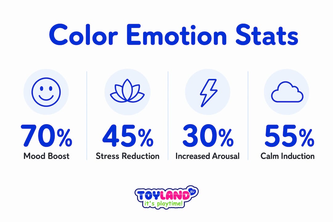
- Color psychology studies how hues influence human emotions, cognition, and behavior through biological and cultural mechanisms. Light colors like blue and green promote calmness, while darker shades such as red and black increase arousal and anxiety, though responses vary individually and culturally. Theories like opponent-process and the PAD model help explain perception and emotional effects, emphasizing the importance of context and personalized testing in design.
Color theory in psychology is the scientific study of how colors affect human emotions, cognition, and behavior through biological, cultural, and contextual mechanisms. This field draws on opponent-process theory, embodied cognition, and the Pleasure-Arousal-Dominance (PAD) model to explain why a blue room feels calming and a red one feels urgent. A synthesis of 72 peer-reviewed studies from 1990 to 2025 confirms that color brightness and hue produce consistent psychological effects across populations. Understanding these effects changes how you see art, design, and even the spaces you live in every day.
Quick summary
Color theory in psychology links specific hues to measurable emotional and physiological responses. Lighter colors like blue, green, and yellow promote calm. Darker colors like black and deep red raise arousal and anxiety. These effects are real but moderated by personal history, culture, and context.
Tl;dr
- Blue, green, and yellow reduce stress and improve mood.
- Black and deep red increase physiological arousal.
- Opponent-process theory explains afterimages and visual limits.
- The PAD model quantifies emotional responses to color.
- Color effects are real but never universal.
Table of contents
- What Are the Main Psychological Effects of Different Colors?
- How Do Vision Theories Explain Color Perception?
- How Do Emotional Models Quantify Color Effects on Mood?
- What Are the Practical Applications of Color Psychology?
- Key Takeaways
- Perspective
- Explore Color-Based Creative Kits for Kids
- FAQ
What are the main psychological effects of different colors?
Lighter colors promote calmness and mood improvement, while darker colors are linked to anxiety and heightened physiological arousal. This finding holds across decades of research and multiple cultural settings. The pattern is consistent enough to inform real design decisions, from hospital interiors to classroom walls.
Blue is the most studied calming color. Research associates it with reduced heart rate and lower perceived stress. Green connects to restoration and focus, likely because of its evolutionary link to safe, resource-rich environments. Yellow, in moderate doses, lifts mood and increases alertness without the tension that red produces.
Black and deep red tell a different story. These hues raise arousal levels and, in some contexts, signal threat or dominance. One striking finding: children’s hand strength was highest in pink rooms, lower in blue rooms, and lowest in gray rooms. That result shows color affects physical performance, not just emotional state.
Color associations in psychology are real, but they are not fixed. Personal context, cultural background, and individual differences all moderate how a person responds to any given hue. A color that signals mourning in one culture may signal celebration in another.
Common color-emotion associations based on empirical research:
- Blue: Calm, trust, reduced anxiety
- Green: Restoration, focus, safety
- Yellow: Alertness, optimism, mild stimulation
- Red: Urgency, arousal, dominance
- Black: Sophistication, threat, heaviness
- White: Clarity, openness, neutrality
- Pink: Calm, reduced aggression, physical relaxation
Pro Tip: Always consider the context before applying color psychology rules. A color that calms adults in a spa may overstimulate toddlers in a playroom. Audience and setting change everything.
How do vision theories explain color perception?
Color perception psychology begins with two foundational theories: trichromatic theory and opponent-process theory. Together, they explain how the eye and brain convert light into the rich emotional experience of color. Neither theory alone is complete. Both are necessary.
Trichromatic theory, developed by Thomas Young and Hermann von Helmholtz, holds that the human eye contains three types of cone cells. Each type responds most strongly to red, green, or blue wavelengths. The brain combines these signals to produce the full spectrum of visible color.
Opponent-process theory, developed by Ewald Hering, goes further. It describes how the visual system processes color through three opposing pairs: black-white, yellow-blue, and green-red. Opponent-process coding produces afterimages and explains the sensory balance the brain seeks after prolonged color exposure. Stare at a red image for 30 seconds, then look at a white wall. You will see green. That is opponent-process theory in action.
This biology has direct implications for art and design. Here is how the sequence works:
- Cone cells detect wavelengths of incoming light.
- Opponent-process cells compare signals from different cone types.
- The brain codes color as opposing pairs, not as independent channels.
- Prolonged stimulation of one channel triggers a rebound in its opponent.
- The result is afterimages, visual fatigue, and the perception of color harmony or tension.
Reddish-green is a perceptually impossible color because the same opponent-process cell cannot signal both red and green simultaneously. One excites the cell; the other inhibits it. Artists who understand this avoid combinations that create sensory conflict and instead use opponent pairs to build visual contrast that feels balanced rather than jarring.
Language adds another layer. Learning distinct labels for similar colors sharpens neural discrimination between shades. This means the words you use for colors actively shape what you perceive. Russian speakers, who have separate words for light blue and dark blue, discriminate between those shades faster than English speakers do.
How do emotional models quantify color effects on mood?
The Pleasure-Arousal-Dominance model, known as the PAD model, is the most widely used framework for measuring emotional responses to color. It maps any emotional state onto three dimensions: how pleasant it feels, how activating it is, and how much control it produces. Researchers use PAD scores to compare color schemes across participants and settings.
One study using the PAD model analyzed 10,600 individual emotional response data points from 216 participants to optimize color schemes for relaxation or stimulation. That scale of data allows designers to move beyond guesswork. Instead of choosing colors by personal preference, they can select hues that reliably produce target emotional states in specific audiences.
The challenge is variability. Individual differences in personality, mood, and past experience mean that no color produces identical PAD scores in every person. The PAD model accounts for this by averaging across large samples and identifying central tendencies rather than universal rules.
| Color | Pleasure | Arousal | Dominance |
|---|---|---|---|
| Blue | High | Low | Moderate |
| Red | Moderate | High | High |
| Yellow | High | Moderate | Moderate |
| Black | Low | Moderate | High |
| Green | High | Low | Low |
This table reflects general PAD tendencies from empirical research. Individual results vary based on context and personal history. The table is a starting point, not a prescription.
What are the practical applications of color psychology?
The importance of color in design is not aesthetic preference. It is applied psychology. Artists, interior designers, educators, and product developers all use color perception psychology to produce specific emotional and behavioral outcomes.
Artists apply opponent-process theory directly. Painters like Josef Albers spent careers studying how colors change appearance based on their neighbors. Placing a warm orange next to a cool blue makes both colors appear more vivid. That effect is not a trick. It is biology.
Interior designers use color to manage arousal levels in a space. Hospitals use soft blues and greens to reduce patient anxiety. Restaurants often use warm reds and oranges to stimulate appetite and speed up table turnover. Schools experimenting with color and child development have found that classroom color affects focus, energy levels, and even physical performance.
Toy design is one of the most direct applications of color psychology for children. Bright primary colors attract attention and stimulate curiosity in infants. Softer, more varied palettes support imaginative play in older children. The psychological effects of color in toys extend beyond aesthetics into cognitive and emotional development.
Practical applications by context:
- Hospitals and clinics: Soft blue and green walls to reduce anxiety and lower perceived pain
- Classrooms: Yellow accents for alertness, blue for focus zones
- Retail spaces: Warm reds and oranges near impulse-buy displays
- Children’s toys: Bright primaries for stimulation, pastels for calm play
- Art studios: Neutral gray walls to prevent opponent-process interference with color judgment
Pro Tip: When choosing colors for a child’s space or toy, match the hue to the intended activity. Stimulating colors work for active play areas. Calming colors work better for reading corners and sleep spaces.
Key takeaways
Color theory in psychology proves that hue and brightness produce measurable emotional, cognitive, and physiological effects, but those effects are always shaped by context, culture, and individual differences.
| Point | Details |
|---|---|
| Lighter colors calm, darker colors arouse | Blue, green, and yellow reduce stress; black and deep red raise physiological arousal. |
| Opponent-process theory explains visual limits | Color pairs like red-green cannot coexist visually, which shapes both perception and art. |
| PAD model quantifies emotional responses | Researchers use Pleasure-Arousal-Dominance scores to design color schemes for target emotional states. |
| Context always moderates color effects | Cultural background and personal history change how any individual responds to a given hue. |
| Language sharpens color perception | Learning distinct color labels increases neural discrimination between similar shades. |
Why color rules are never the whole story
Color psychology is one of those fields where the research is solid and the oversimplifications are everywhere. I have seen designers confidently declare that blue always calms and red always excites, then wonder why their carefully color-coded space produces the opposite effect in half the people who use it.
The concept that changed how I think about this is contextual decoupling. A color you love in a small swatch can feel overwhelming when it covers four walls. Abstract preference and real-world perception are genuinely different psychological processes. Most color advice ignores that gap entirely.
The historical record supports skepticism too. Kurt Goldstein’s 1942 hypothesis that red impaired motor function while green improved it became widely cited. It has never been reliably replicated. That is a warning about how easily a compelling narrative outruns the evidence in this field.
My honest position: use the research as a starting framework, not a rulebook. Test your color choices with real people in real contexts. The PAD model gives you a structure for doing that systematically. The biology of opponent-process theory gives you guardrails for avoiding sensory conflict. Everything else requires observation and iteration.
— Thane
Explore color-based creative kits for kids at toylandeu™
Color psychology does not stay in the classroom or the art studio. It lives in the toys children use every day. Toylandeu™ carries creative kits designed to put color exploration directly in children’s hands, turning psychological principles into play.
The Enchanting Kids Art Workbook Montessori Drawing Kit guides children through structured color activities that build both artistic skill and emotional vocabulary. For kids who learn through doing, the Colorful Drawing Scroll offers a hands-on DIY format that encourages free color exploration. Toylandeu™ ships both kits worldwide with free delivery, making color-based creative learning accessible to families everywhere.
FAQ
What is color theory in psychology?
Color theory in psychology is the study of how specific hues affect emotions, behavior, and cognitive responses through biological and cultural mechanisms. It draws on opponent-process theory, the PAD model, and cross-cultural research to explain and predict color effects.
Do colors actually change your mood?
Yes. A synthesis of 72 studies confirms that lighter colors like blue and green improve mood, while darker colors like black and deep red increase arousal and anxiety. Effects vary by individual and context.
Why can’t you see reddish-green?
Reddish-green is a perceptually impossible color because the opponent-process cell that signals red is inhibited when green is present. The same neural channel cannot fire for both colors at once.
Is color psychology the same across all cultures?
No. While some physiological responses to color are consistent, cultural background and personal experience significantly moderate emotional reactions. White signals mourning in some Asian cultures and purity in many Western ones.
How does language affect color perception?
Linguistic labels for colors sharpen neural discrimination between similar shades. People who have distinct words for closely related colors perceive and distinguish those colors faster than people whose language groups them under one term.